Portrait & Avatar
Personal Color Analysis Infographic – Soft Autumn Palette
by @XShreyaYadav
Full prompt (English — copy this into Studio)
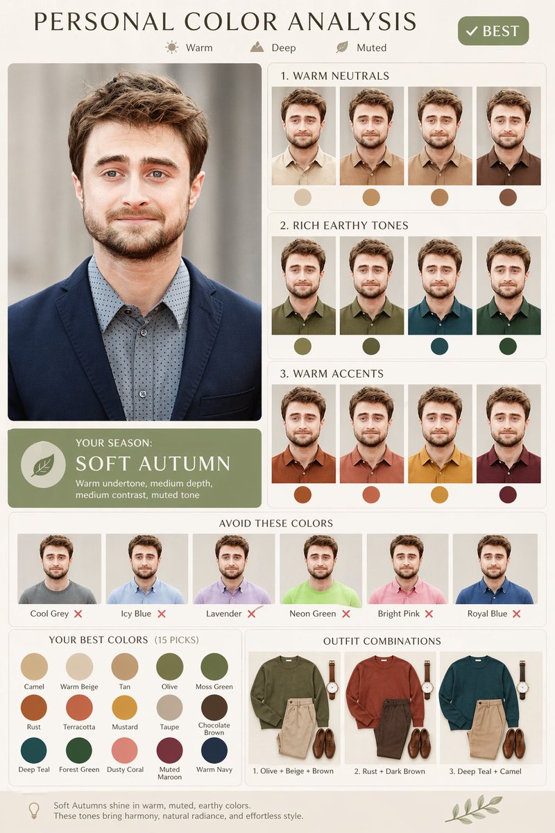
Use the uploaded image as the face reference (high identity preservation). Keep facial features, hairstyle, skin tone, and proportions EXACTLY the same across all variations.

Create a premium, clean "Personal Color Analysis" infographic.

LAYOUT:
- Split design (2:3 or 4:5 ratio)
- LEFT: Large portrait of the person (sharp focus, soft natural lighting, neutral blurred background)
- RIGHT: Structured grid of smaller portraits showing the same person in different shirt colors

TOP HEADER:
- Title: "PERSONAL COLOR ANALYSIS" (modern minimal typography, elegant spacing)
- Small icons + labels: "Warm", "Deep", "Muted"
- Add a green badge: "✔ BEST"

MAIN PANELS (Right Side):

1. WARM NEUTRALS
- Beige, tan, camel, warm brown shirts
- 4 small portraits (same face, only shirt color changes)
- Add circular color swatches below each

2. RICH EARTHY TONES
- Olive, moss green, deep teal, forest green
- Same layout style

3. WARM ACCENTS
- Rust, terracotta, mustard, maroon
- Same layout style

SEASON BADGE:
- "YOUR SEASON: SOFT AUTUMN"
- Subtitle: "Warm undertone, medium depth, medium contrast, muted tone"
- Use a soft green label design

AVOID SECTION:
- Show portraits wearing:
 cool grey, icy blue, lavender, neon green, bright pink, royal blue
- Add red ❌ below each

BOTTOM SECTION:

"YOUR BEST COLORS (15 PICKS)"
- Show palette swatches:
camel, warm beige, tan, olive, moss green, rust, terracotta, mustard, taupe, chocolate brown, deep teal, forest green, dusty coral, muted maroon, warm navy

OUTFIT COMBOS (Flat lay style):
1. Olive + Beige + Brown
2. Rust + Dark Brown
3. Deep Teal + Camel

STYLE & RENDERING:
- Minimal UI, premium aesthetic
- Soft cream / off-white background
- Clean grid alignment
- Subtle shadows, rounded cards
- Realistic fabric texture on shirts