Design & Branding
Leading causes of death Infographic with image 2.0
作者 lupusk9
中文摘要
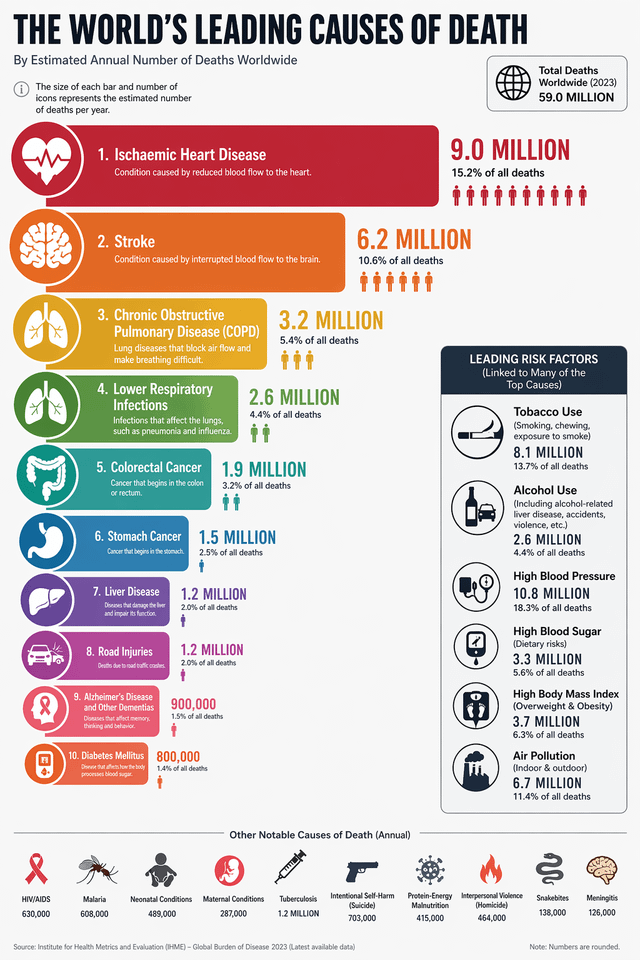
制作一张信息图,对比全球主要死因(如疟疾、艾滋病/HIV、酒精、烟草、心脏病、暴力犯罪等)。各主题图标尺寸需按死亡人数比例缩放(如烟草图标远大于疟疾)。使用最新全球统计数据,并为每项配合适当图标。
完整 Prompt (英文, 复制带去 Studio 用)
make an info graphic comparing the world leading causes of death (eg; malaria, aids/hiv, alcohol, tobacco, heart disease, violent crime or whatever else, etc etc) Make the graphic of the subject scale to the size of the number comparatively - example tobacco's would be way bigger than malaria's. get the most up to date global statistics you can. use an appropriate icon for each. for things like alcohol if you can link some related accidents to it somehow maybe make that link obvious (example a drunk driver causes car crash killing other people) tried twice it seems to have changed its mind on the statistics sources and style.