Design & Branding
极简个人色彩分析板
EN: Minimalist Personal Color Analysis Board
作者 IQRA👑
中文摘要
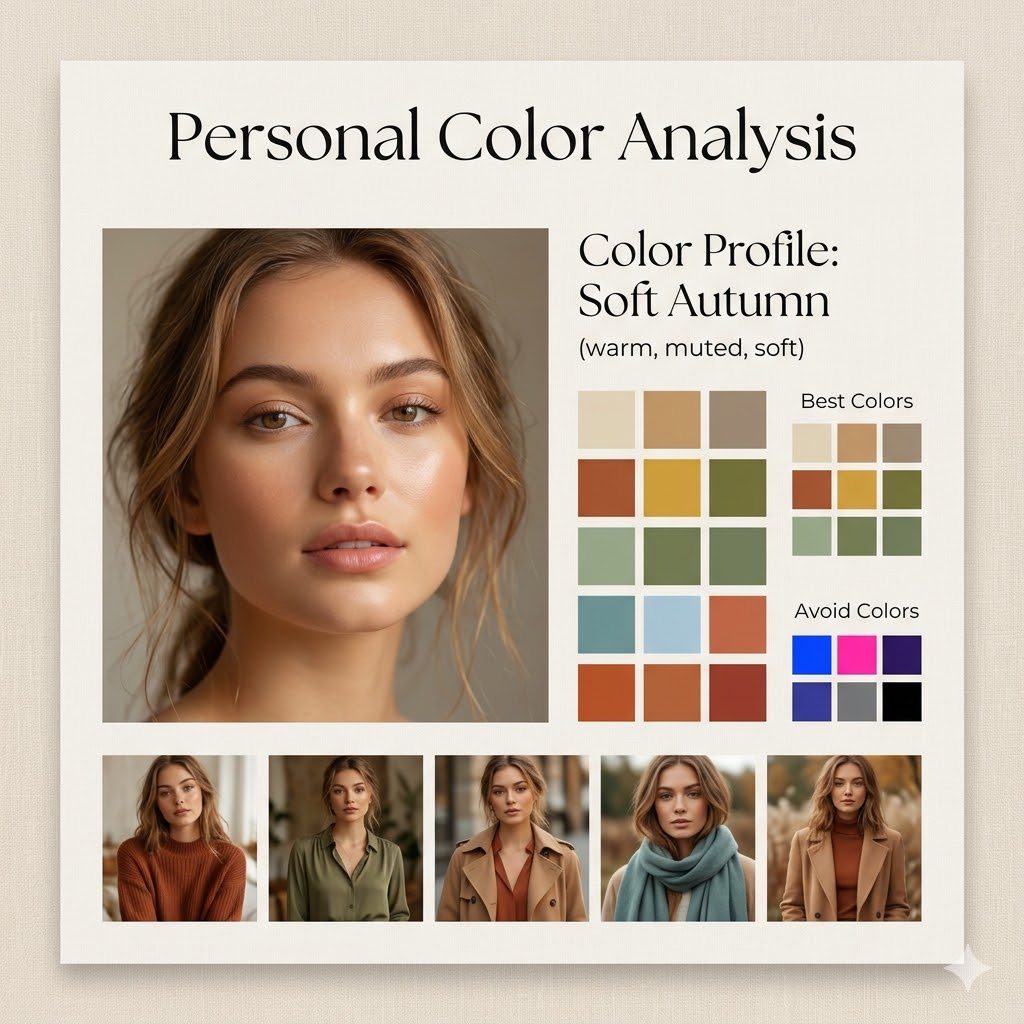
设计一张1:1比例的极简风个人色彩分析板,采用{board style}风格。中央放置一位{subject}的特写肖像,妆容自然、光线柔和。上方或旁侧标注“Personal Color Analysis”标题,并包含“Color Profile: {”信息区。
填这些变量
0 / 1填好变量后点「立即创作」, 实际值会自动替换 {xxx} 占位符并跳转 Studio
完整 Prompt (英文, 复制带去 Studio 用)
Design a square (1:1) aesthetic personal color analysis board in a {argument name="board style" default="soft beige, minimalist style"}.

Place a close-up portrait of a {argument name="subject" default="young woman"} at the center, featuring natural makeup and soft daylight lighting.

Add the title “Personal Color Analysis” above or beside the portrait.

Include a section labeled “Color Profile: {argument name="color profile" default="Soft Autumn (warm, muted, soft)"}”.

Display clean color swatches featuring warm neutrals, earthy tones, muted greens, soft blues, and terracotta shades.

Add a “Best Colors” grid along with an “Avoid Colors” grid highlighting overly bright or cool tones.

At the bottom, include 4–5 small images of the same woman styled in outfits that match the recommended palette.

Use a refined combination of elegant serif and minimal sans-serif fonts, soft shadows, and a clean editorial layout.

The background should be warm beige with a subtle texture.

Ensure the design feels spacious, polished, and Instagram-ready.